V5.22 Raises the Limits: More Virtual Devices, More Thermostat Plugins, Easier Sharing
With the eWeLink app V5.22, Prime members get higher limits for virtual devices, thermostat plugins, and device sharing.
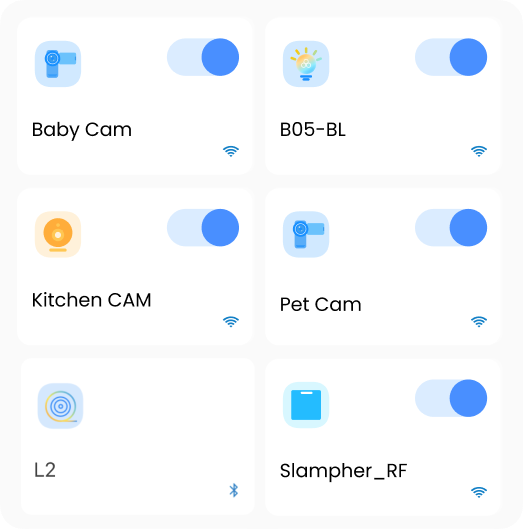
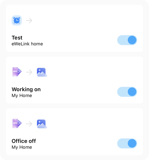
If you have updated the eWeLink App to V4.31, have you ever noticed the freshening up on the home page as well as the Scene page? Yeah, in V4.31, we’ve optimized most device icons and the Scene related icons. Are the new changes looking nice? Of course, our actions go beyond merely grabbing your attention. Instead, we want to enhance your user experience based on your suggestions.
Tab animations can no doubt, improve the user interface’s usability and engagement. Users receive better visual feedback from it, making navigation simpler than before. The tab of each page you enter will be animated, making it easier for you to identify the page you are currently on.

The home page’s icon swap makes it simpler to initially recognize and locate each device. Suppose you have more than 30 devices, it may be difficult to keep track of where each one is. You may now quickly identify the devices you want to utilize, improving the usability and intuitiveness of our app.

We have made two major changes to the Scene page. First, the icons of the manual scene tiles are modified. You can tell the manual scene’s function very clearly by selecting the right icon. For instance, the icon of a lightbulb shows that a lighting device will be turned on/off by tapping the scene tile. Secondly, we have updated the icons in the Condition and Action sections. When users switch to the Auto Scene page, they can identify what the conditions and actions stand for.


We acknowledge that the optimization is not yet perfect. Constructive criticism and suggestions for improvement are welcome, whether it’s related to icon redesign or App interaction. The widget icon optimization will be happening soon, by the way. Stay tuned!
With the eWeLink app V5.22, Prime members get higher limits for virtual devices, thermostat plugins, and device sharing.
Set up the eWeLink MCP Server to control supported devices with AI using natural-language commands.
With scene names now visible in logs, you can finally connect every device action to the automation behind it.
eWeLink App V5.21 brings smart home control to your Wear OS watch.